[CLIENT]
COMCAST
[INDUSTRY]
TELECOMMUNICATIONS
[EXPERTISE]
BRAND & IDENTITY DESIGN
SOCIAL & DIGITAL ASSETS DESIGN
BROCHURE & PRINT DESIGN
EVENT SIGNAGE & WAYFINDING
[OVERVIEW]
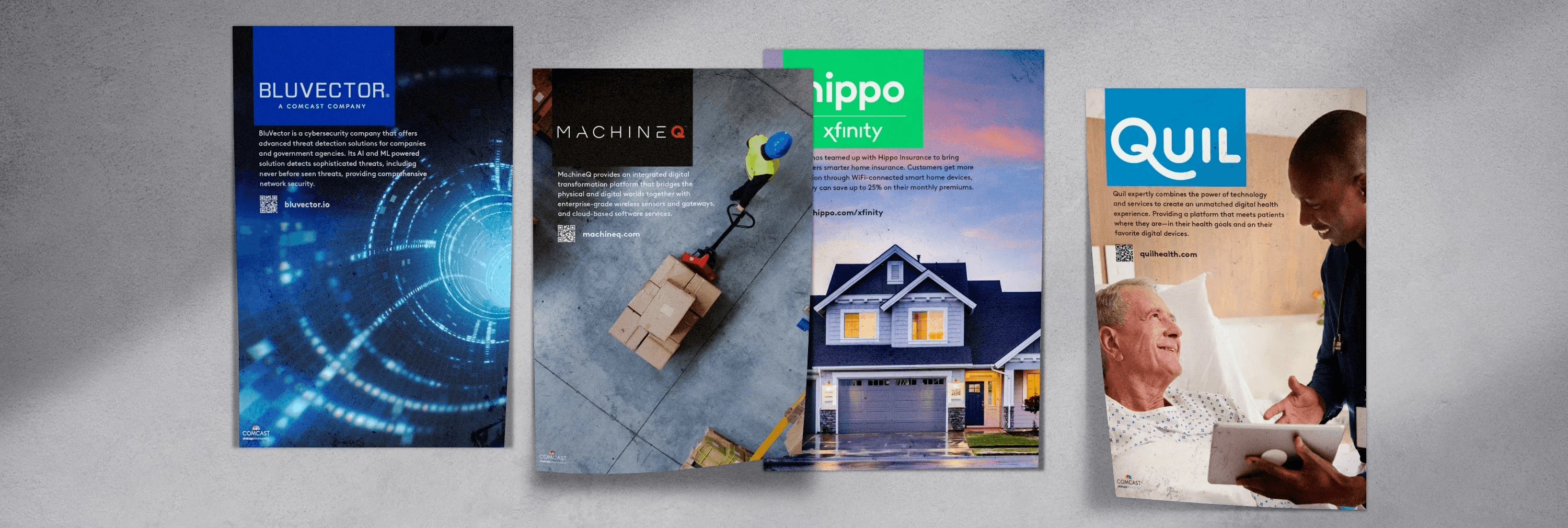
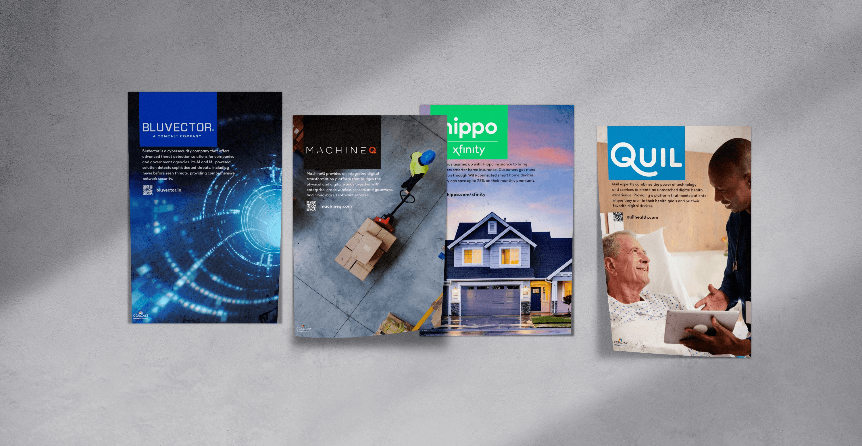
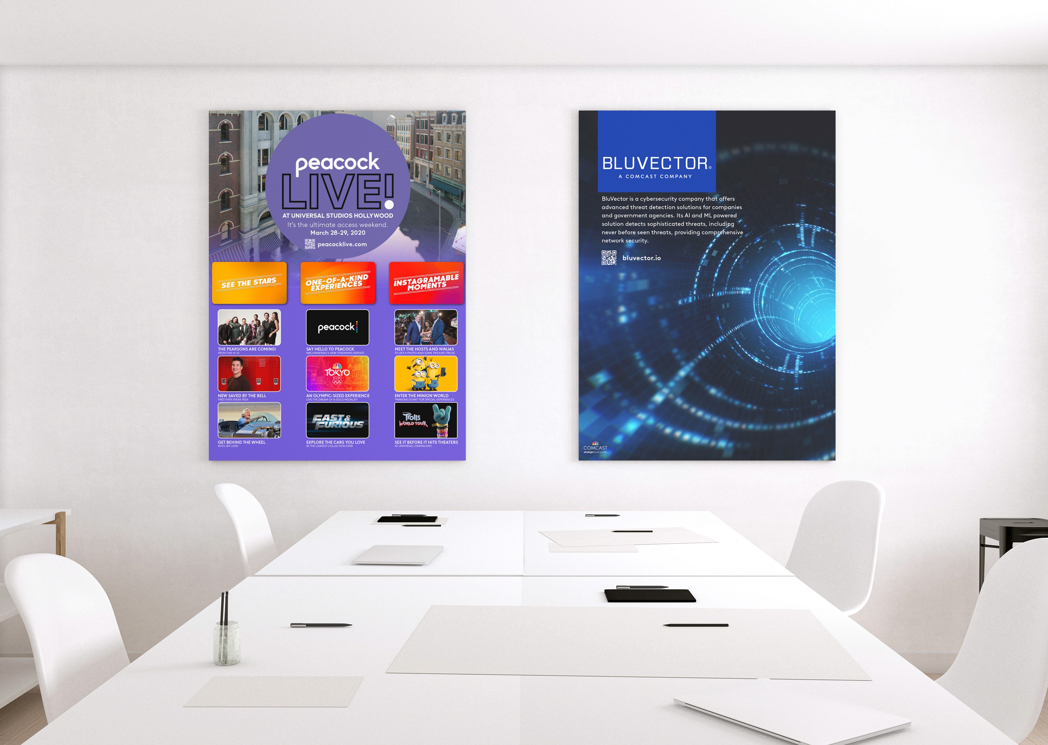
Comcast asked for a simple, minimalist poster template that could promote their recently acquired companies they worked alongside, to employees and clients inside offices and shared spaces.
The goal was clarity and recognition at a glance, including BluVector where I had worked, with a system that looked modern, printed cleanly, and could scale across multiple brands without redesigning from scratch.
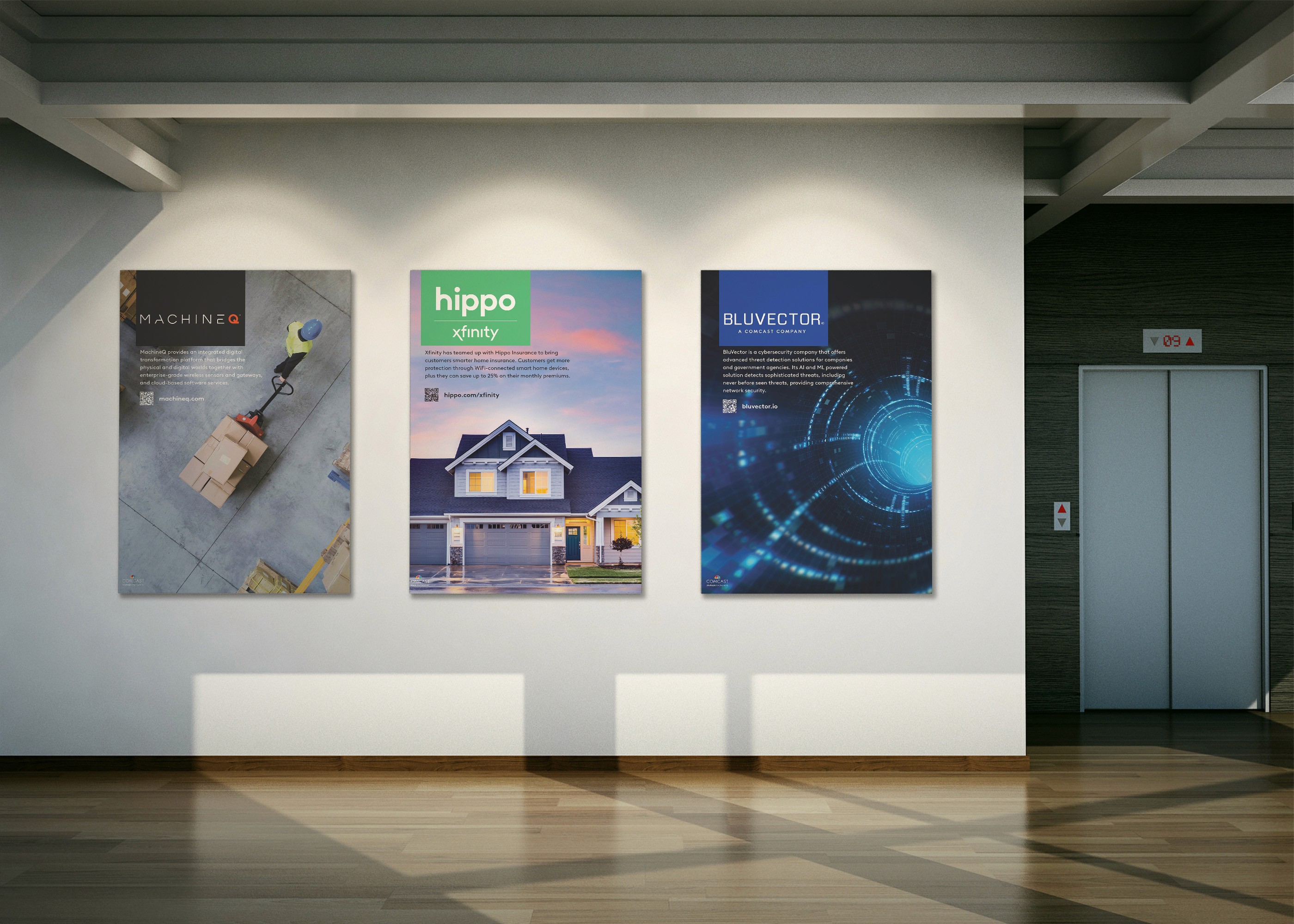

I built a modular template centered on a single powerful image that speaks directly to what each company does. The layout pairs that image with a short, plain-language paragraph that highlights how the company benefits Comcast customers.
Consistent typography, logo placement, a fixed QR code for quick access to more information and a visible URL for anyone who prefers to type. The grid and type scale keep hierarchy predictable, so viewers can scan the poster in seconds and still find the details if they linger.

[
WORKS
]