[CLIENT]
BLUVECTOR / COMCAST
[INDUSTRY]
CYBERSECURITY
[EXPERTISE]
WEB & MOBILE UI/UX DESIGN
SOCIAL & DIGITAL ASSETS DESIGN
BRANDING & IDENTITY DESIGN
LOGO & ICONOGRAPHY DESIGN
[OVERVIEW]
I led the end-to-end visual refresh of BluVector’s threat-detection cybersecurity product, spanning research, theming, component design, and page-level layouts, to make the software faster to read and easier to use.
The scope covered a new light/dark theme system, a modernized type and icon language, refined color tokens for status and severity, and updated dashboards and event views.
We also aligned the interface to the company rebrand, moving from BluVector Cortex to BluVector ATD (Advanced Threat Detection) so the product name and imagery is unmistakable in screenshots, docs, and demos.
The objective was consistent: reduce cognitive load, speed triage, and reflect the sophistication of the detection engine.
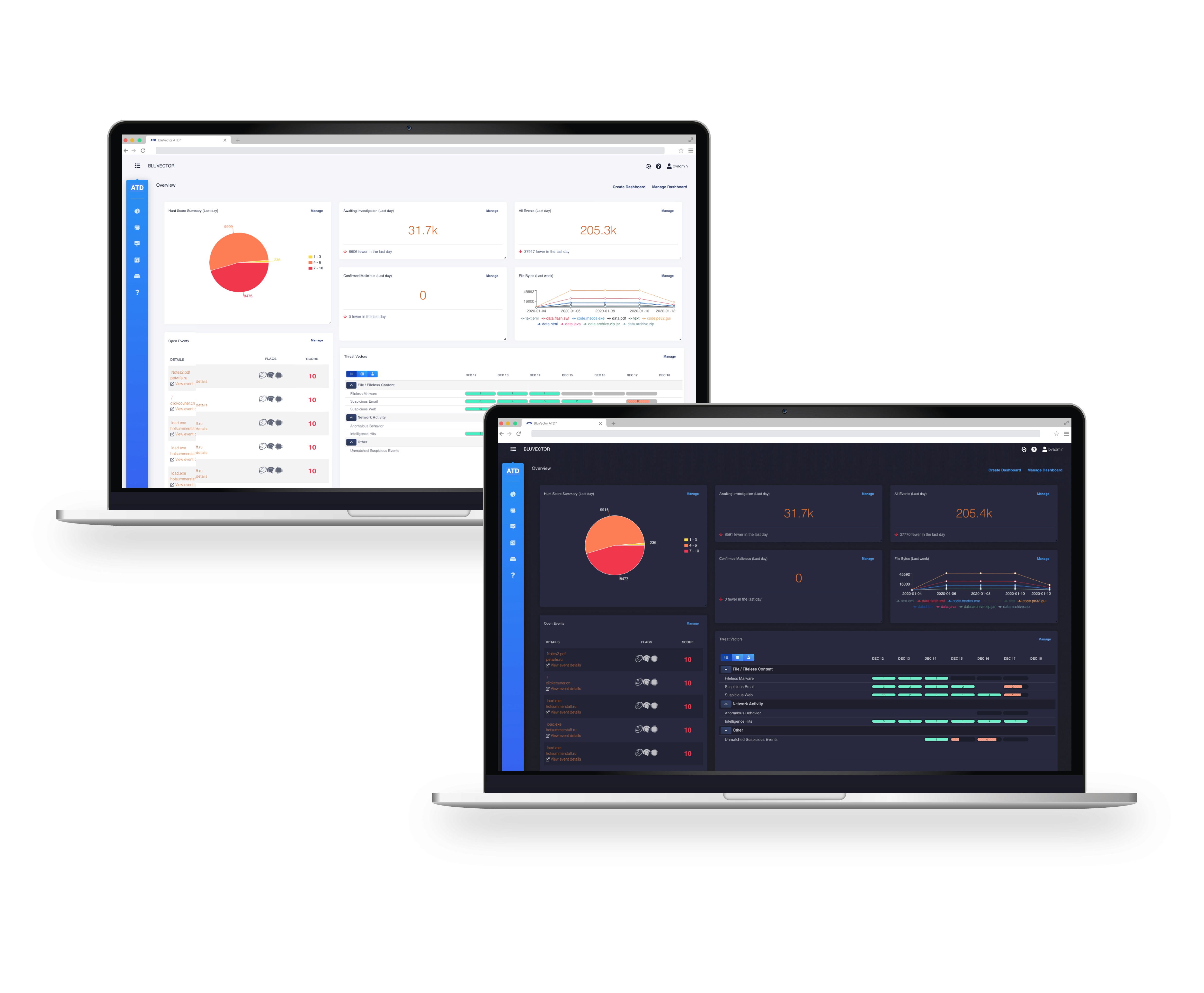
NEW LIGHT MODE
NEW DARK MODE
Based on client surveys, we introduced light and dark modes as a core setting so analysts working in dim server rooms or bright offices could choose what’s comfortable and legible.
From there, we modernized the GUI: standardized typography for quick scanning, replaced dense labels with clear, distinguishable icons, and tightened contrast for priorities.
A calibrated yellow-to-red color severity scale and a library of 500+ custom threat flag icons make state changes obvious and communicate type, filename, and family without wading through long strings of text—all while staying within approved brand colors.

OLD LIGHT MODE
NEW LIGHT MODE

OLD LIGHT MODE
NEW DARK MODE


[
WORKS
]