[CLIENT]
BLUVECTOR / COMCAST
[INDUSTRY]
CYBERSECURITY
[EXPERTISE]
WEB & MOBILE UI/UX DESIGN
SOCIAL & DIGITAL ASSETS DESIGN
BRANDING & IDENTITY DESIGN
LOGO & ICONOGRAPHY DESIGN
[OVERVIEW]
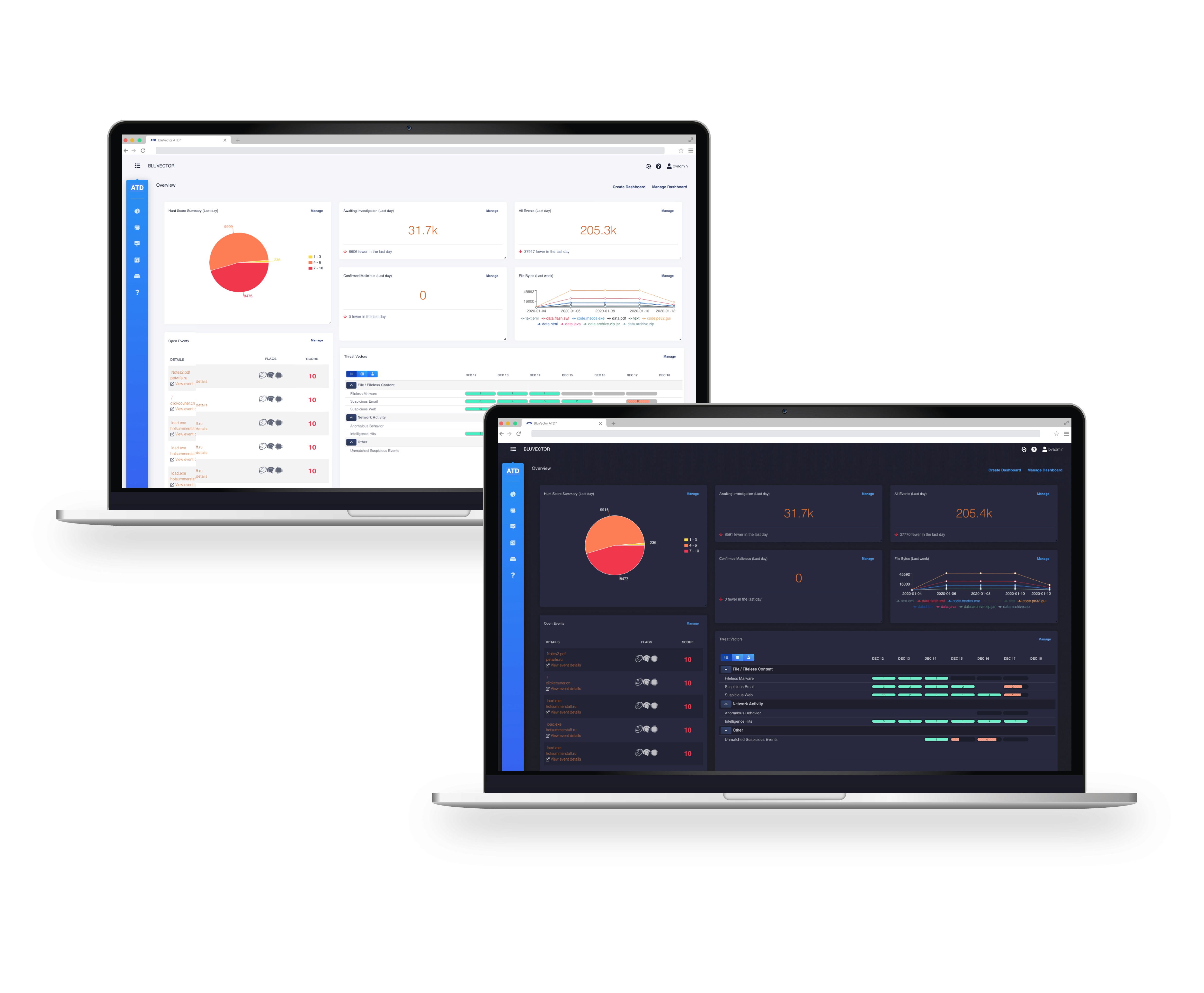
When I joined BluVector, the company’s visual identity did not match the sophistication of its cybersecurity platform.
The logo, documents and marketing pieces all felt dated and inconsistent, which made it hard to tell a clear story in a crowded, high tech market.
As the sole designer, I led an ongoing brand evolution that repositioned BluVector visually, aligning the look and feel with the company’s AI driven threat detection and giving the team a cohesive system to build on.


The refresh started with core identity work: refining the BluVector logo and icon set, modernizing the Cortex product mark, and building a consistent visual language for datasheets, threat reports and product documents.
Each asset type received its own structure and badge treatment so it was instantly recognizable, but everything shared the same typography, color hierarchy and dark, digital textures.
From there, I extended the system into social media templates, campaign graphics, and physical product visuals so that no matter where someone encountered BluVector, the brand felt unified and current.


[
WORKS
]